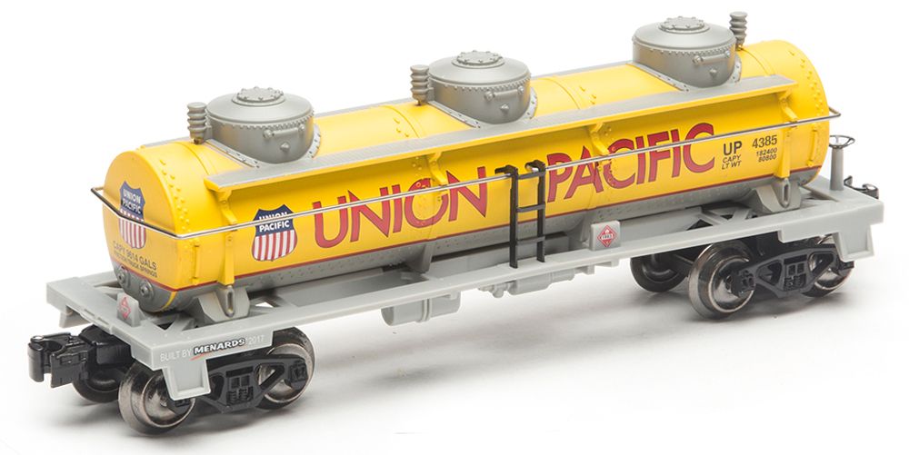
I applaud Menards for developing colorful and affordable trains.  With the recent release of their Union Pacific Tank Car, I found both letters "N" in "union" to be unlike anything I had seen before in Union Pacific font.  Take a look at the below photo of the Tank Car.  The upper left corner of the N and the lower right corner of the N come to a point. 

I've also included a photo below of the Menards Union Pacific Hopper where the N is flat (i.e. horizontal) at the upper left and lower right corners.  This seems to be the more traditional font that UP uses.

I can't wait to see the next Menards Union Pacific release.  I'm curious if it will use the pointy N or the flat N.

Stu


Original Post

Replies sorted oldest to newest

The problem on the tank car is that Menard's is using Futura, a font commonly installed on computers.  It is similar, but not the same, as the actual typeface used by the UP.

You can see that the points on the N rise above and below the line, which is not the case for the real UP typeface. You also can see quite clearly that the crossbar on the A is too high compared to real UP lettering, and the ends of the C do not match the UP typeface.

It also looks like Menard's uses Helvetica or Arial, very common fonts on computers, to print the numbering on the cars. Not like the real thing and makes the numbering stick out.

It always surprises me that manufacturers don't take a few minutes to ensure they're using accurate lettering. It's especially glaring for the UP, where the typeface is such a distinctive part of their corporate identity.

Add Reply

Post
×
×
×
×
Link copied to your clipboard.
×
×