Having given some time for things to settle down, and to get used to things, I haven't noticed anything that would cause me grief with the change at this point. However, there are some small things that would be nice to address. also some comments on the trouble some others are having. As a note my experience may be different to that of other users, I primarily read the forums on Mac with Safari.
#1 Three bars vs. the full menu at the top of the page:
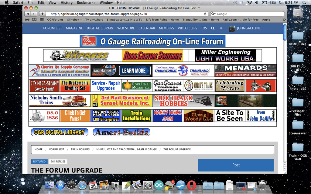
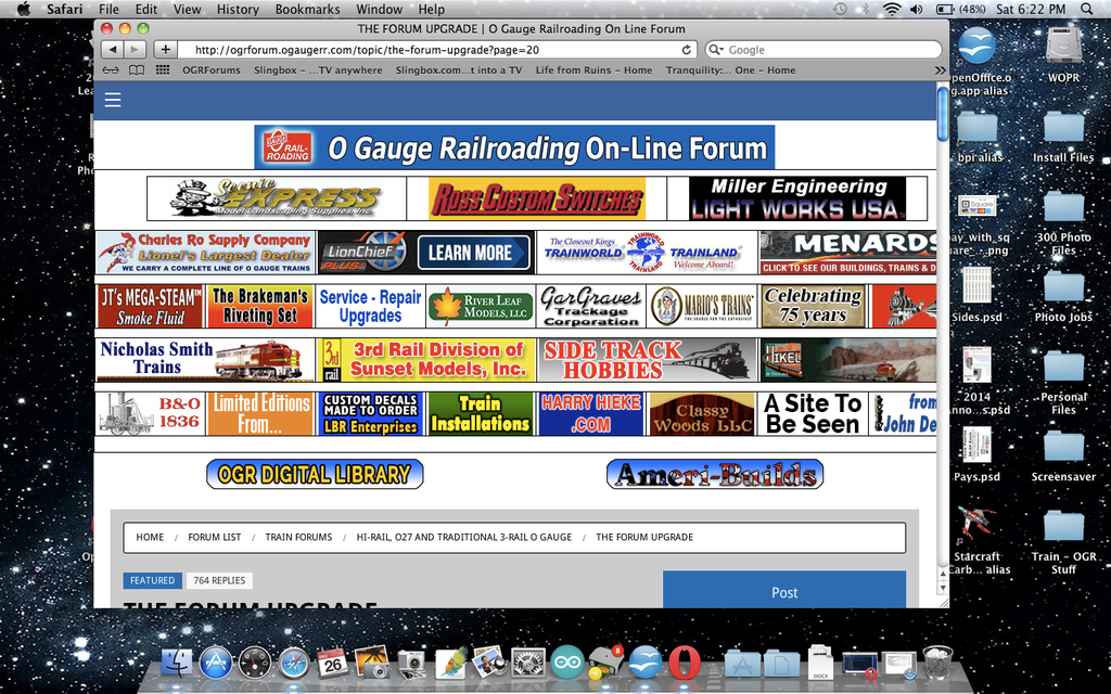
This one isn't really a problem, but could be confusing for some users. The software detects the width of the window you have open, so if it is wide enough, ex. full screen, you will see the full menu bar. On the other hand if the window is not wide enough, ex 3/4 the width of the screen or less, it will show the three white bars. This is pretty much the standard symbol for a menu on mobil devices, but pretty uncommon to see on full sites for display on a computer. It isn't a problem, but may take getting used to for some folks.
Screen shot with wider window:

Screen shot with window slightly narrower:

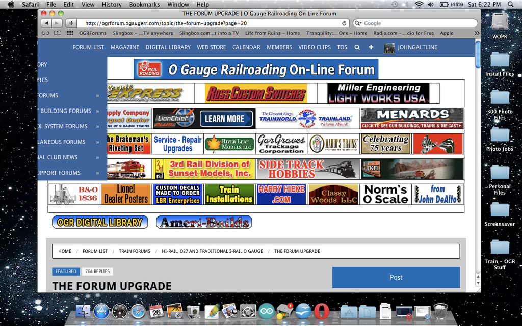
As a side note to this, if the window is not wide enough, the drop down menu for 'Forum List' still cuts off whatever does not fit. This seems to happen because the menu 'drops down' aligned to the right side if the 'forum list' heading, so the box doesn't fit on the screen.

#2: No next/previous buttons on each forum page's listings:
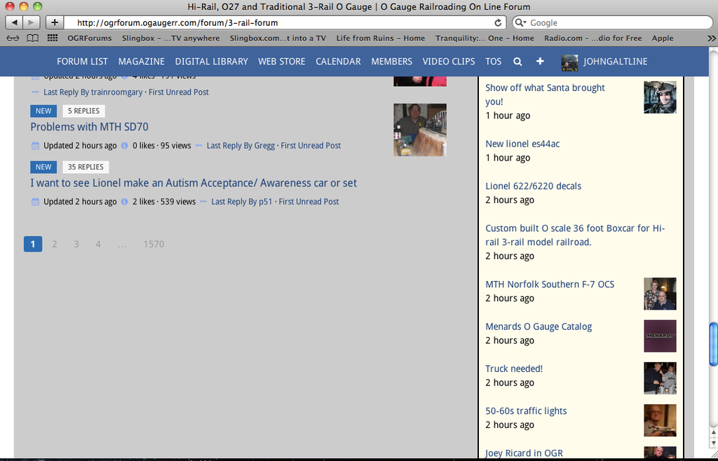
I mentioned this one a while back, but didn't see any comments on it, so I'll drop it in again. it's not a particularly big deal, but just seems awkward to have only the page numbers and no next page/previous page buttons on the forums when you are looking through the topics. they are there in an individual thread, but not on the list of all the threads in a given forum.

#3 No indication of what forum a post was made on in recent posts side bar:
This one has been mentioned by others, and I seem to recall that it was being looked into. That said I bring it up again because of a slight annoyance it has caused. It seems since the update went live there are many more people commenting on posts in the specialized forums such as tin plate or 2-rail scale that do not look to see that the question posed is specific to that particular group, and holds a much different meaning when asked about tin plate versus o-gauge as a whole. I think folks are clicking on a recent topic, reading the post and commenting, without consideration that their answer has nothing at all to do with the specialized nature of that particular sub-forum. It is also annoying when you click on what seems an interesting topic only to find it is a For Sale post.
Thanks for your time, and all the hard work to resolve everyone's issues.
JGL


