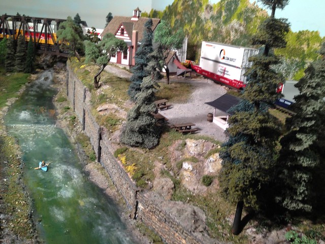
We're staying pretty much with an open feeling for our scenery and layout.  That is to say, instead of the dense almost cluttered feeling of some layouts, with almost every inch covered with buildings, people, cars, etc, we're going for the more open feeling of Northwestern Montana, etc.  Fewer buildings in a couple of smaller towns, fewer people and cars (five people working in the diesel shops, with four cars outside, for example ...)

Is anyone else going with the open less-dense look?

Photos for ideas?

Original Post

Replies sorted oldest to newest

Like to see both approaches, but space is always a premium commodity.  As much as it is nice to see all the beautiful stuff that people have on display/in use (not stuck in boxes - which is my problem), I opted to go the open less-dense approach. But I also have the basement area to stretch out and model the railroad/era that I choose to do.

IF I  had the room on my new layout (I don't - it's in a 10'x12' room), I would do both ... I like the feel of spaciousness with a loc and consist running all by its lonesome through a nicely scenic-ed area.  Hardy anything is better looking.  OTOH, I enjoy the compact feeling of a busy town (not city) as well as individual "scenes" (space, Hallowe'en, etc.)  PLUS an area for old-fashioned fun:  Lionel accessories compactly distributed in a thoughtfully designed track area.

The above describes MY layout ... if I only had the room.  

Good idea.  I'm going to concentrate our industry/businesses on an industrial island in the middle of the layout, with 036, (more or less) curves so only switchers and freight cars can get onto it.  Two bridges lead onto it; a Lionel lift-bridge at one end and a Lionel drawbridge at the other. And two small towns.  One up at Cabin Lake, .... summer cabins and a store.  On the lower level one with a scrap yard, tavern, motorcycle repair shop,  and run-down crew hotel across the tracks from the engine terminal. 


Real Estate, if I only had more real estate! But I don't so it's cluttered I be.

I do appreciate some nice transition scenery between vignettes when I view a layout. Though it's in my nature to try and pack twenty-five pounds of hobby in a ten pound bag.  

Tis the dream, but what you see in most magazine layout articles, is every square inch paved with track, sparsely dotted with buildings and a stray Rextoy. My mirror says that is what l will wind up with, for l have overbuilt buildings, some large, so that if many are plunked down, there won't be room for the gravelly strjp of one abandoned siding.  Space...a lot of it out there beyond the moon, not enough in here.

My in the process of being built layout is an around the room layout with strategically placed settings along the way.  I don't like the cluttered look nor do I like a lot of sidings.  I spent a lot of time planning for such a look. 

0304172104

Here's what I think of when I see layouts that cram every inch of real estate with track.

train spaghettie bowl

Attachments

Images (2)
  • 0304172104
  • train spaghettie bowl
Last edited by wild mary

My layout is all about the trains and track. Buildings will be very limited, mostly industries served by the railroad. No cute vignettes, very few people or automobiles, heck, not that many trees. I know it's not what most people would do, but my layout is designed for operation, not for looks. That is not to say that looks aren't important, but rather secondary to the trains and track. It becomes totally obvious when I say that the layout has over 3000 feet of track and over 300 switches.

Elliot makes a very good point. Different people have different objectives for their layouts. His is about the trains; many others are about beautiful buildings; others are unabashedly toy-like fairylands. In my case, the layout is "about" Lionel postwar operating accessories. You can't do all these things well in a single layout, because often they conflict. I believe that great layouts become great because their builders are deliberate about what they are trying to accomplish.

I do not have much room for scenery be they buildings, cars, farms, or mountains since most of my layout will be covered in track.  Like Elliot, I'm looking for operation (and the occasional loop running) and I need yards, terminals, industry tracks, and runaround sidings for my locals to work.  I kept my yard as small as I could but it still has an arr/dep track, 4 class tracks (two for east bound, and two for west bound), a yard lead, a cabin track, a couple of engine pockets, and an icing track.  I doubt you will be seeing any of my stuff in the scenery forum.

When my son and I were planning our layout, we had the same decisions to make as most of us do. We decided to leave lots of open space. On the lower level we have a small depot with water tower and sand facility and a few freight and other sheds, a wye. A small logging area. On the upper level another destination with the engine facility, turntable, small roundhouse, water and sand. A small sawmill area, and a yard for freight cars. This is in a 12' x 16' shed. Around the wall track plan. 

Last edited by WP
Kerrigan posted:

We're staying pretty much with an open feeling for our scenery and layout.  That is to say, instead of the dense almost cluttered feeling of some layouts, with almost every inch covered with buildings, people, cars, etc, we're going for the more open feeling of Northwestern Montana, etc.  Fewer buildings in a couple of smaller towns, fewer people and cars (five people working in the diesel shops, with four cars outside, for example ...)

Is anyone else going with the open less-dense look?

Photos for ideas?

You have already decided by selecting a geographic area. I like that approach.

Watch a few of the Aerial America shows on for the holiday. Watching the loooong trains slide through the plains and foothills is quite different than the more congested areas of the coastal areas of the country where the trains are shorter.

Forum member JacobPaul81 went the scenery of Missouri's sediment layers for his Topeka, Kansas City & St. Louis railroad. A few areas of the layout were to be industrial or city. Traveling from one to the other was natural scenic features only. You can probably scroll through the thread and check the photos.

I don't recall the builder, but I saved this photo of the west silver bow river scene. No buildings in this area. (Last photo) One of the best sweeper track scenes I have seen.

Add some slight track movement to the track in your natural scenes to avoid a rock abutment or such to add additional interest or block the view of train for a short area with a mound or cluster of trees to create some visual interest.


Attachments

Images (3)
  • Missouri sediment layers
  • painting test
  • w silver bow river

I am in favor of the less-dense look, perhaps because I am accustomed to the wide-open spaces of southern Arizona. My current layout is a very simple single-track arrangement (2-rail) with very wide curves on which articulated locomotives actually look pretty good. Maintenance and repair work is minimal, so I can just run a train when I want to without much fuss. There is nothing inaccessible or hard to reach, and there are very few structures that could be damaged by clumsy fingers. A Rio Grande wooden water tank, a plate girder bridge lettered Rio Grande, an A-B-B-A set of Rio Grande F-3 units, and Rio Grande caboose at the end of each train identify the setting. I store several locomotives in a kind of "staging" yard, including some lettered for other roads (on the model of the DM&IR 2-8-8-4s that went west to the D&RGW when the Lake Superior ore boats stopped operating during the winter).

I'm of the "less is more" school. The only place that will be dense is the rail yard. I like your eye to be drawn to the trains traveling through a large area. I posted this picture of my mining area last week on the forum about making mountains. This is only about a third of the mountain space. There is a short line servicing the mines below and the main line runs above. Still making a metal bridge for that line. All will have overhead wire. The buildings are just sitting there now. Not sure if they are in their final place yet. If you enlarge the picture you will see some wooden towers, top right. They will carry ore buckets from another mine to be processed in the big red building. DonDSC_5365

Attachments

Images (1)
  • DSC_5365

IMO, scenery density is inversely proportional to layout size and any hope to approach a realistic appearance. My scenery is primarily industrial buildings on sidings within a single loop. The buildings are fairly large with the hope that they hide as much of the track and train as possible. It is primarily a switching layout.

I have heard it said that the "Spaghetti bowl" layout designs of the past are passé now (along with the old-school mindset of massive club layouts with a high-placed operations 'balcony' where operators don't come within tens of feet of the trains). I agree. Point-to-point layouts were hardly ever seen in magazines even when I was a kid, but they're pretty common now.

The hobby is growing up in several ways and track planning certainly seems to be changing from, "How many loops can I stuff into this room?" toward more of, "What is more realistic for a real railroad, route-wise?" mindset when it comes to track planning.

And along with it, some are now embracing the idea that a square foot of layout doesn't have to have a siding (barely enough for one freight car) and a single structure jammed into it.

Last edited by p51

It's true... the layout is a blank canvas to be built upon based the imagination, talent, budget, and desires of the builder. I'm lucky to have some expansive size, although clearly not as large as some. It gives me the opportunity to have a nicely defined engine service area, and compact town, a large imposing mountain and nice runs in between. I had a photographer from a Louisville magazine yesterday and they're doing an article on my hobby and the model that I've made for the Heaven Hills Visitor Center in Bardstown, KY. Heaven Hills produces some of the best Bourbons in the world.

They asked what my focus was based on the very high quality that I strive for in my structures. I said that it's a place to show off the work and have fun running the trains at the same time. The trains I have represent prototypes of my favorite large locomotives, generally in the late 40s and 50s, but my rolling stock and even the structures are sort of anachronistic being from the 40s to the present day. I have loops so trains can run continuously, but have yard and all sections of the layout available to all other via 27 Ross switches so I shouldn't have to physically pick up and move a locomotive.

I like eye candy and produce building and industries that represent very high input model making. I am a model maker first and a model railroader second. There are kits from Bar Mills, Steam Era Structures, Berkshire Valley and Westport Model Works represented plus a scratch-built replica of a 1870s distillery and modern material handling system feeding it. Streets are a little too narrow, but building spacing is reasonable. Much detail work remains to be done, plus more buildings. I have telephone poles and street signs that need putting up.

Woodbourne Village Status 12-16

Engine house is slated to be built and placed to the right of the sanding tower.

Coal Station One

The layout's 39 X 15', all L-girder and open in the middle. It has a swing out gate on casters to allow easy access into the center.

Layout as of Jan 17

Other scratch-built structures are a Victorian-style station modeled from one that appeared in Moder Railroader a while ago that was on the NYO&W RR. And a substation modeled after ABB switchgear and a freelanced main transformer. The station is all styrene with a Plastruct slate roof. The substation is mixed media.

Substation in Site 11

Bottom line: Build it how you want. It's your railroad.

Attachments

Images (4)
  • Woodbourne Village Status 12-16
  • Coal Station One
  • Layout as of Jan 17
  • Substation in Site 11

Congrats on the article. You have a very nice layout, so it's well deserved.

I often wonder what folks like you would do if you didn't have that space. Would you settle for a running layout with minimal landscaping in favor of more track like I'm doing or would you just not bother with the hobby? I'd love to build a "model railroad", but space and budget won't allow it, so I compromise. If it's a choice between the hobby with spaghetti track or no hobby, I'll take the hobby. I will try to make it the best it can be, but I won't apologize for not having a "model railroad". So I subscribe to your "build it how you want" mantra.

My fantasy layout is 500' long by 3' wide.  Double track main line with realistically spaced buildings and towns, and yards at each end.

Realistically, I have been blessed with a 10 1/2' x 12' train room.  I have used compression to create vignettes.  Buildings and scenery hide some of the track  and backdrops help make the layout seem larger than it actually is.

Tom

DSC02120DSC02121DSC02122DSC02123DSC02124DSC02125DSC02126DSC02127DSC04900DSC04903DSC04893  

T

Attachments

Images (11)
  • DSC02120
  • DSC02121
  • DSC02122
  • DSC02123
  • DSC02124
  • DSC02125
  • DSC02126
  • DSC02127
  • DSC04900
  • DSC04903
  • DSC04893

Regardless of size, you can still do masterpieces. Frankly, the size is a two-edged sword. Everything you do requires more materials. Over 350 feet of track, 150 pounds of ballast, a dozen bottles of W-S Scenic Cement, and on and on. My wife's main comments when she'd come downstairs during construction was, "Jeez! It's really big!" And that wasn't a compliment. I explained that size matters in diamonds and model railroads. If I had a space half the size, I'd still strive to do unique things. That's just the way I am.

My layout is in kind of a unique position wrt size. it is "about" Lionel postwar accessories. My goal when I started the project was to build a layout that (a) showed off accessories in the best possible light; (b) had space for each and every accessory that appeared in the 1957 Lionel catalog, plus many of my other favorites; and (c) avoided the "long rows of lined-up accessories" that one often sees in the layouts of accessory collectors.

The problem was that, although I have a whole room to work with, it is not a particularly large room. When I started to lay out the plan, I discovered that space was very tight. In order to do a decent job with all three goals, I was forced to make aggressive use of the third dimension. I am too close to my own work to judge how good a job I did, but I do know that the use of grades, hills, cliffs, and mountains did a lot to complement the accessories and minimize the "jammed together" look on what really is a pretty crowded layout.

IMG_0429IMG_0431IMG_0433IMG_0450foo 1accessories 2station [1)timber tunnel 2

Attachments

Images (8)
  • IMG_0429
  • IMG_0431
  • IMG_0433
  • IMG_0450
  • foo 1
  • accessories 2
  • station (1)
  • timber tunnel 2

It really looks like you've accomplished you goals! Really nice. There's definitely a part of my psyche that would like to have a bunch of operating accessories, like I had on my childhood layout. I especially liked all the coal accessories and had the belt loader, the coaling station and the coal ramp (the trifecta). By choosing my current theme, I've closed myself off from this kind of railroading.

Avanti posted:

My layout is in kind of a unique position wrt size. it is "about" Lionel postwar accessories. My goal when I started the project was to build a layout that (a) showed off accessories in the best possible light; (b) had space for each and every accessory that appeared in the 1957 Lionel catalog, plus many of my other favorites; and (c) avoided the "long rows of lined-up accessories" that one often sees in the layouts of accessory collectors.

The problem was that, although I have a whole room to work with, it is not a particularly large room. When I started to lay out the plan, I discovered that space was very tight. In order to do a decent job with all three goals, I was forced to make aggressive use of the third dimension. I am too close to my own work to judge how good a job I did, but I do know that the use of grades, hills, cliffs, and mountains did a lot to complement the accessories and minimize the "jammed together" look on what really is a pretty crowded layout.

IMG_0429IMG_0431IMG_0433IMG_0450foo 1accessories 2station [1)timber tunnel 2

Very nicely done!  Mission accomplished I'd say.

Add Reply

Post

OGR Publishing, Inc., 1310 Eastside Centre Ct, Ste 6, Mountain Home, AR 72653
800-980-OGRR (6477)
www.ogaugerr.com

×
×
×
×
Link copied to your clipboard.
×
×