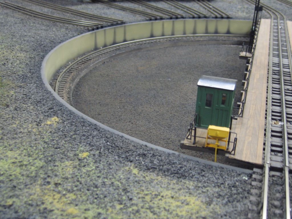
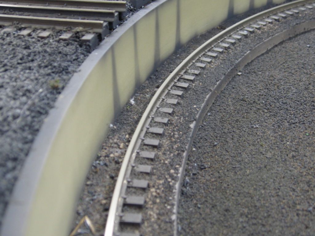
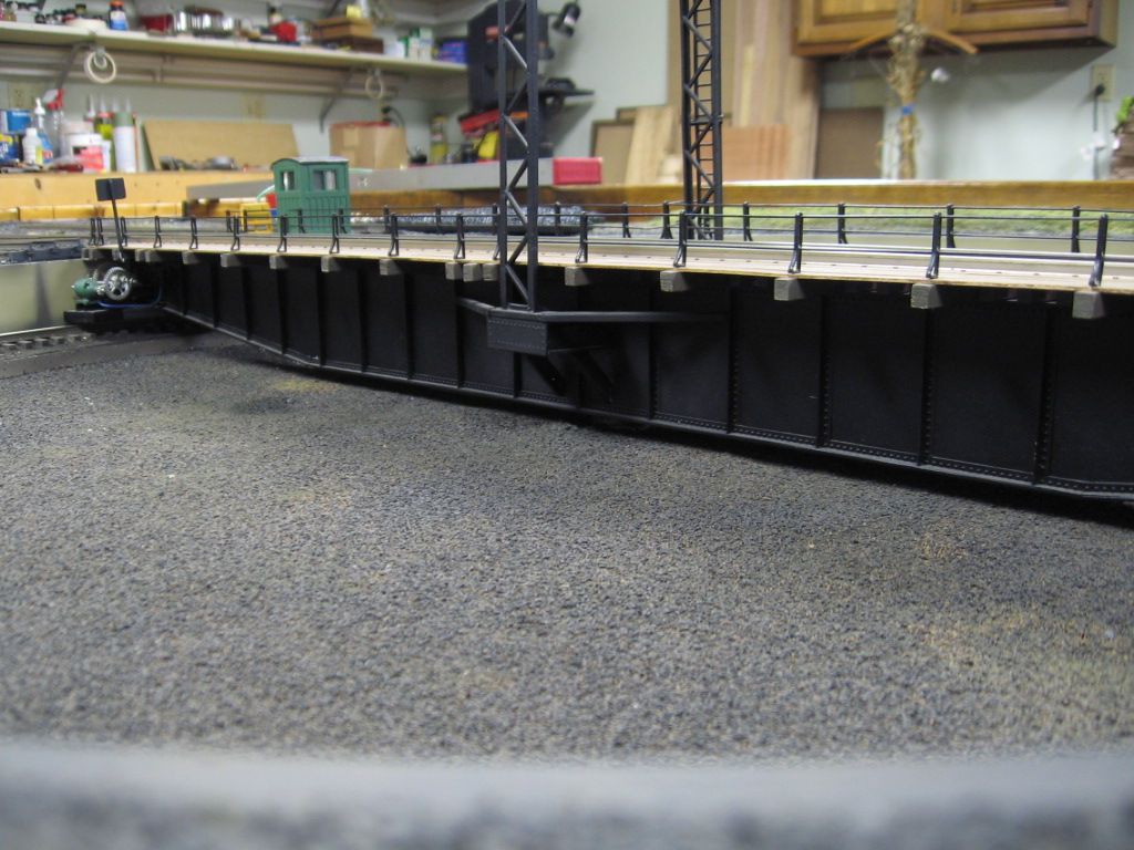
I had the same issue. I used a combination of the sands from Brennan's hoping to get a grittier look. And it worked, but the color was too uniform and the whole thing, as you say, did not 'pop'. But, I don't think you need it to 'pop', you need it to look less uniform.
I ended up experimenting with zip texturing, as well as randomly laying down various india ink washes in order to get variety into the color. The zip texturing did not quite get me what I wanted in terms of the color palette, but it certainly did add variety in color shades. The india ink was a bit more successful. I am still working on this, but the difficult thing with the sand is it doesn't take color very well.
My suggestion is to look at it from a color perspective, not a 'more stuff' perspective. Also, random tufts will add A LOT. Be judicious on placement (near building, poles etc. But near the tracks is ok too. I was in Roseville, CA a few years back staring at the UP yard and noticed that not only was the ballast/ground cover colors similar to what I have (black yard ballast from Brennan's/sand color similar to yours), but there was more vegetation throughout the yard thanI would have thought. Also, add sand along the rails where the engines might find the going a bit slippery. In most yards I have seen, there is alot of sand along the rails.
Hope this helps.
Dave
![]()
![]() I forgot to put them back. The ground cover still needs to be glued anyway.
I forgot to put them back. The ground cover still needs to be glued anyway.


