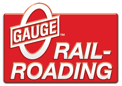
In the new catalogs...has anyone noticed something odd about the 115th Ann. Logo.
|


|
Replies sorted oldest to newest
The MPC era Lionel logo?
Yes! Out of place for sure...and an odd mix. I wonder if the logo designer knew that? Or was just working from a folder of clipart files.
The whole thing is rather uninspired. It reminds me of those tacky generic foil stickers that companies slap on mailers and such announcing some nonevent event.

It makes perfect sense, unless you're at the aged end of the train-buying demographic. The center of the "hobbyist" demo has moved from those that grew up with The Lionel Corporation to those who were raised on Lionel/MPC/Fundimentions.
I turn 51 next month, and every catalog that came out in my formative years had that type-face.
Jon ![]()
Nostalgia is a potent emotion that Lionel applies quite effectively. However, I find this graphic confused and dated. The use of a 45-year old logo from a period of production that many would argue was less than shining, braced with a font ("Brush") that was designed in 1942 suggesting that their young, toped with the classic "L", a watered down version of their current logo, doesn't instill thoughts of a bright future. It's a mixed message. Mike got it right, it's clipart. The thing looks like a ransom note.
I think it makes sense, even though the graphic is a bit uninspiring. I'm closing in on 40, and I can remember fondly that Lionel type-face. That font takes me back to when things were way simpler.
Not my favorite font or era of product that came out of Lionel during those years. Other than that, looks fine to me.
With me it wasn't a matter of like or not like. I loved the General Mills era and still do. From a current Lionel branding standpoint I just find it odd. Its like Cadillac going to the effort of currently redesigning their logo...and then using the old logo on the back of instruction manuals in new cars. In these days...with branding...you gotta have a clear image.
Should it say "115 years and Neil Young"

It's no gonna be changed, so why worry about it? I didn't even notice it in the catalog until this subject came up.
Rusty
I hadn't noticed but I like it!
Maybe they'll have these made into pins. Nice giveaway at York! Hint, hint. ![]()
I actually like the Banner, and I am Glad I collect/operate Lionel Trains. I have been buying Lionel Trains since the late 1940's through today. So much has changed, so many Likes/Dislikes, however, Lionel Lives On, for that I am so Thankful. Let's all have fun with Lionel Trains. Happy Railroading. (The New Catalog is Beautiful, 2015 Signature Edition)
Classic Circle L and MPC Era, I thought was a nice mix. What I found odd was the lack of a product with that logo.
Suits me fine, as long as it has that big "L" in it. ![]()

Actually, the most egregious issue is the lack of the trademark protection symbol. You would think that with all the planning that is done in advance Lionel would at least place a "TM" on the logo even if they haven't filed yet.
Only the unwashed argue that.
Like a "tempest in a teapot"! ![]()
I don't dislike or like the logo, but I think I understand their attempt at "little of this and a little of that era" mixture to the design.
Maybe Lionel is saving it's best design offering for their 125th anniversary, or we missed the "true" collector's angle to #115 which is really a factory defect: 1900 to 2015 is 116 years.
![]()
1900 to 2015 is 116 years.
![]()
WRONG. It is 115.
Nothing wrong about promoting this milestone and I am OK with the logo selected. Why not take advantage of a long history in the business and capitalize on this when you can.
Probably all of the products related to the 115th Anniversary will sell well, including the silver plated Berkshire.
I sort of like it, too. It is not a great logo, but I don't care that much one way or the other.
I am very happy, however, that Lionel is celebrating 115. that is cool.
No one commented on the word "young" after 115 years. Have they done this before?
1900 to 2015 is 116 years.
![]()
WRONG. It is 115.
Even without hindsight, it's pointless to respond to you who appoints oneself as the definitive authority on everything and displays it with such subtle style and class. Good job and well done.
I do like the logo...never said otherwise. Just though the font looked odd, making me question if it was intentional.

Whew.
The neon pub clock (115th anniversary version) was made in a very limited run of 115, too. I wanted one of those but they are scarce. And not paying the crazy asking prices I see out there now.
I'll wait. ![]()
Access to this requires an OGR Forum Supporting Membership
