What about all those Lionel catalogs of the 1950's with artist renderings????
Rusty
I can already hear the gasps, the clinking of pitchforks, and the clamor for my hide, but I don't like them at all. I'll take MPC/LTI catalogs. Bob Sherman was an immensely talented man, and his art was wonderful, but I only need to point to the (in)famous black Warbonnets to make my case. Can you imagine the hue and cry today??
Well, the black Warbonnets were a very rare example of a significant error in one of those classic catalogs (caused, allegedly, by a photo in a shadow light condition that made the silver appear black, which photo was given to Bob Sherman; this light phenomenon is not unique).
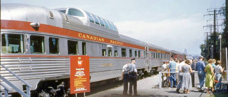
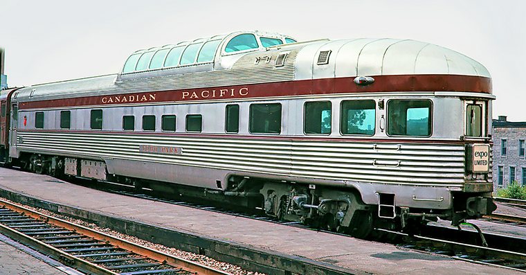
I think the main factor is that many folks today are far more concerned (some would say hung-up  ) with prototypical accuracy in their trains than people were back in the 50s. There's an excellent publication (don't have the name of the book) that I've seen that discusses and shows photos of the prototypes that inspired various Lionel model trains in the 50s. The Lionel replicas were similar but with varying degrees of accuracy, depending on the model. Many folks today would howl about those variations!
Adherence to realism is OK, though - I like prototypical accuracy, too, and it's irritating when Lionel gets colors wrong (which is getting more common today than in the past). In this case, though, at least as shown in this picture, the Lionel model looks pretty good to me. The CP cars were not glossy silver. If any part of the car appears a little more shiney, it's only the non-corrigated roof on the rear of the observation cars, but even there the metal isn't glossy by any means.


