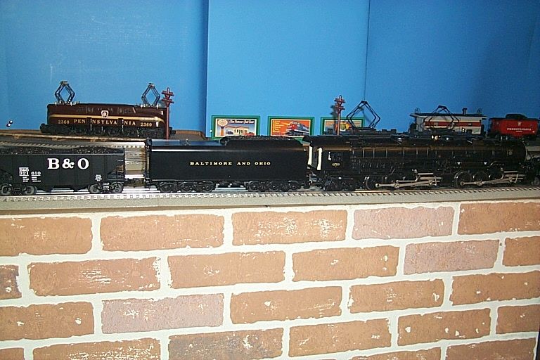
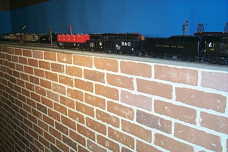
I need some ideas for how you guys are handling your fascia's both in terms of shapes, materials, and especially colors.  I have been making mine out of Masonite, but haven't decided what is the best color to paint them?  I like making them curved as I think it gives a good look, but it is more work. 


What is the best color?  I like the earth brown look, but I have also seen some sage green that looks really nice too.  I want something that will showcase the layout but not compete with it.  I want the attention on the picture not the frame.


I plan to hang some skirting below the fascia and again can't decide on the color.


Art

fascia1

fascia2

fascia3

fascia4

Attachments

Images (4)
  • fascia1
  • fascia2
  • fascia3
  • fascia4
Original Post

Replies sorted oldest to newest

I like my facia/skirting to match the rest of the room. I like to continue the wood trim in the room onto the layout. If your wood trim is painted, paint the trim on the layout the same color, as an example. Same with wall color. It makes the layout look like a part of the room, like another piece of furniture.

What you have in the pictures looks fine to me for the shape and materials and I think I'm with you on the earth brown color for the fascia.  Then maybe somewhere between that and the floor color for the skirting or even matching the floor color so it might blend in with the floor. That would be cloth skirting, I presume? What I was thinking of anyway. I think a lot of folks like black for the skirting, but it looks like your room is nice and bright and the black skirt may darken it and take away from the nice light look.

bLACK, the color of what you do not want to see.

matt-trains setup looks great. The ruffled skirt look is soo out there. No offence to those that have that look, but , really, you can do better.

frames with taught fabric would enhance so many layouts.

we spend a fortune on trains, then put some ruffles around the table??

Fred

I'm doing 1/4" masonite painted flat black. It won't be flush with the top of the layout, but will have a 1" lip in the hopes of catching any derailments before they take the plunge.


As for the flat black, it doesn't catch the eye and draw attention to itself, thus making the layout and trains the focus. Add a black skirt, and the layout almost looks like it's floating.


Photo May 07, 4 41 05 PM

Attachments

Images (1)
  • Photo May 07, 4 41 05 PM
Originally Posted by Chugman:

That is a very interesting idea.  I have stained oak trim in the room.  But trying to curve it to match the current fascia would be very hard and probably not worth the effort.  Maybe I can incorporate some of each?  I have stained oak trim around my control panels.


Art

Oak is available in 1/4" X 4' X 8' sheets, which is bendable. Depending on the height of the facia and the amount of aisle space to be covered, a sheet can go along way. Also, kitchen cabinets or similar shelving on wheels can fit under the facia for parts and other layout related items, with train boxes stored behind the cabinets.

Don

Originally Posted by Chugman:

You make a very good point Elliott.  That is what I want to do is make the trains the focus and not the fascia and skirting.  One of my friends recently used heavy-duty black landscape fabric for skirting and it does have that effect.


Art

I've heard of the landscape fabric idea, and really like it. Easy clean and inexpensive. That's the last project, for when everything else is done.

For fascia I am using 1/4" lauan plywood (also known as Philippine mahogany) stained a dark reddish brown with a mahogany or rosewood stain, then varnished. All of my edges are straight. Since you have a curved base, to get the same effect you would simply use veneer and contact cement. The stain and varnish would be added after applying the veneer to the base. It's not terribly difficult, and of course you could use any kind of wood and color of stain. You could even use a wood veneer and a black stain - remember 20 years or so ago, when black-stained ash or oak veneer was all the style for bookcases and stereo stands? I have not decided yet what to do about skirts. Probably dark brown canvas, cotton duck, or muslin.

I'm for cheap. This stuff covered our couch under the clear plastic outer wrap. As soon as I saw it I instantly thought "ahhhh, layout skirt". It's attached with Velcro squares. Definitely makes you to draw attention to the table top instead of the plastic bins and a shop vac behind.


The facia is next. There's only a 2x2 x 10' on the front face. Going to add on another 2x2 and then nail a nice finish board to the front.


I bought Lionel print fabric at Walmart several years ago and it's still in the bag. Just seemed too complicated to get it sewn up even though my wife volunteereed.


tmp_20140608_223225982152740

Attachments

Images (1)
  • tmp_20140608_223225982152740
Last edited by Roman

I generally stain all my bench work with Mimwax ebony to display faux creosote appearance. I guess using Masonite, stain is not an option and what ever you choose will have to be paint. My only concern with your particular layout would be that it so large in an already pleasently bright room; how much would a dark color alter the esthetics of the space. I may prefer a lighter color to blend in with the rest of the room in that situation.

Hate to add a non-black suggestion, but when planing our layout room and mentioning using black, my wife said "no way".  So I ended up with a neutral grey to match the carpeting.  But then I also place shelving under the tables to store/display the rest of my collection.  Not disagreeing with the premise that black highlights the layout, but have to agree with my wife that the overall look of the train room is more pleasant with the lighter colors.

IMG_7442

Attachments

Images (1)
  • IMG_7442

You have all given me good ideas and comments, thank you.


But I am still on the fence.  I really like the idea of black as it definitely focuses all the attention on the trains and layout which is what I want.  It also has the advantage of using black landscaping fabric for the skirting which is very economical.  That is a big deal because I have a couple hundred feet to cover.


I do like the lighter, earth tones in the room now and I think my wife would have some reservations about introducing so much black into the room.


Maybe I should use the lighter brown on the fascia and a dark brown for the skirt?  Can you get anything economical in a dark brown?


Great discussion.


Art

I wouldnt use 2 different colors... that would make it stick out by drawing attention to it. I did black/black on my switching layout, and black/black over at my Dads house on the big layout. I like CSX Al's layout the best because not only did he use black/black, he also blacked out the ceiling in the room. So when you look at pix of his layout, the only thing you see is the layout.

I did black ceilings in my bar and the game room and love it. Im not saying you should do that, but black on black really forces your eyes to the layout and not all the stuff around it.

I also agree that earth tones are the best for most applications. I also have ordered my curtains which will be pleated. They look fantastic. 


Black is fine if your going for the museum look but I think  it is just too dark especially in a basement location. 


I think a layout room should be bright and inviting not dark like your in a cave.


Peter - I have been studying the picture of your layout and there's a lot to like there.  The overall effect is stunning.  I love the shelves under the layout.  I see you have a beautiful curved bridge that I would love to see more of.  You have created a very inviting room for your trains.


Art

There are nice pictures above of different ways folks have decided to go with their fascia and skirting.  We all may have differing opinions of what looks best, but it boils down to what you like best...and in some cases...it may involve having to satisfy more than just what you want since a spouse or significant other may need to be considered.  Using my layout as an example, it is brightly lit...not a cave as is asserted by David above...and those of you that have visited me have agreed that it is an inviting space.  I have been to many layouts including those in upper floors as well as in basements and I never noticed that a black or dark fascia/skirt color scheme made the room less inviting or especially dark.  What I did notice is that the eye was drawn toward the layout details.  Use the color scheme YOU want but don't put down other's choices.


Alan

Hi Chugman,

Thanks for the kind words.  Here are a couple more shots of the bridge.  Its design is taken from a real bridge, called the **** Canyon bridge, located shortly north of us.  I tried to model the actual bridge although made of couple concessions: it is straight in real life, a quarter mile long and about twice that tall!  Oh well, modelers license.


The scene was the result of another of my wife's suggestions, she liked the idea of scenery dropping below the table tops toward the floor.


IMG_2688

IMG_0336

Attachments

Images (2)
  • IMG_2688
  • IMG_0336

Peter - That bridge is beautiful!  I love the setting too with the highway bridge below it.  I agree with your wife about the drama of the scenery extending below the table top.  I have been struggling with how I will treat my bridge location where I want a dramatic, realistic looking bridge that will extend below the table tp.  I have a double-track and that makes some bridges not look right in my opinion.  I have pretty much decided mine will have to be a stone arch bridge, but I love the looks of yours.


Art

Here is a photo of the fascia I made out of quarter-inch lauan (Philippine mahogany) plywood. The color is actually much more uniform than is suggested by the photo. The varnished surface reflected the camera flash unevenly, resulting in the light and dark blocks on the image. True color is close to the lighter shade. The fascia is about 5" high, covering the benchwork and table top behind it. The fascia sticks up slightly above the table top to keep small parts, etc. from falling off. The edges were rounded on a router table. 


Fascia 1

Attachments

Images (1)
  • Fascia 1
Post

OGR Publishing, Inc., 1310 Eastside Centre Ct, Ste 6, Mountain Home, AR 72653
800-980-OGRR (6477)
www.ogaugerr.com

×
×
×
×
Link copied to your clipboard.
×
×