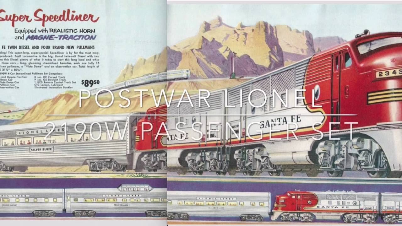
For quite awhile now I've been 'disappointed' at many of Lionel's catalog images and wondered why. Something didn't seem 'right' and they certainly lacked the 'punch' or Wow factor of the post war images that truly took you to the desert of the southwest and the Warbonnet Santa Fe or the docks of New Orleans with "The Swift, the Mighty Southern" ABA with the huge steamship at the dock.
In looking at some larger images of recent F3's that Marty E posted a link to, it suddenly dawned on me - somehow, the lead A unit in Lionel's illustrations is actually smaller than the trailing A unit! The handsome nose of the locomotive looks 'squished' and 'diminutive' in the images. And not just the F3s', but ALL the locomotives are portrayed like this and have been for years now. What do you think? Do you like these 'unflattering images'?


They almost look like HO models and certainly lack the massiveness and visual power of the actual models. Am surprised that someone in their graphics department over all these years didn't do something to correct this as this is not unique to one or two catalogs.
We are constantly discussing how to bring young people into this wonderful hobby but stop and think - would a boy (or girl) be inspired to want a train from these images? Think back at YOUR impressions when perusing the old catalogs with images like the ones at the bottom here.


BIG difference, life changing difference too!


