I am sorry but no, the color image I previously supplied was indeed precisely the as delivered scheme used on all of the O&W "44 tonners." That is prior to the adaptation of the EMD FT's gray yellow and orange scheme. The color scheme conversion was already well underway by June 1946 as shown in a side by side, same day comparison in the book, "The New York Ontario & Western in Color."
What is happening here is that you (as well as many others) have understandably misinterpreted the Ortho-Chromatic B&W film image which you have posted one such example above. The sheet metal joint provides a sufficient diverging angle to affect the shades of gray in the image, causing this misinterpretation. BUT, if you remain genuinely honest, very carefully look at your image above and going from left to right on the hoods themselves and above the silver stripe, you will notice there is an inconsistency in those shades of gray. Some areas clearly showing it is in reality a uniform hue from the silver stripe all the way up to and over the top! The black and maroon in some areas being completely indistinguishable from each other.
Long obsolete, Ortho-Chromnatic B&W film, renders reds and oranges as virtually black and on the opposite side of the color wheel, blues to turquoise green as almost white. It is a real problem when one approaches the interpretation of period images without a working knowledge of the film's reactions to this color information.
This maroon/black "Ortrho-Chromatic B&W to color" interpretation problem is especially true when attempting to interpret the O&W's #405 "Mountaineer" locomotive. When seen from only Ortrho-Chromatic B&W images, (as painted from May 1938 until November 1941) it is simply impossible to know "what color went where." I found this to be so confusing after the 1970 publication of "To The Mountains By Rail" which featured a color painting of the 405 as the "Mountaineer" on it's cover, that in 1975 I spoke with the late Manville B. Wakefield on his interpretations of this locomotive's color scheme. He admitted to me he'd never seen the locomotive in the maroon orange and black scheme and that his paintings were based entirely on the description published in a 1938 issue of Railway Age magazine. After many years of searching, I managed to turn up several color slides, from previously unknown photographers. These indicated the engine and the entire train for that matter was painted far differently from what anyone who'd never seen it in person and only in period B&W photos had imagined.
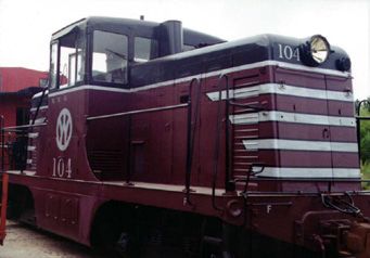
NYO&W #104 as photographed on June 16th, 1946 on 35mm Kodachrome 1 by my good friend, the late John M. Prophet III appears on page 20 of "The New York Ontario & Western in Color" in this, the as-delivered scheme. The simple proof that this was the only scheme prior to the use of the EMD scheme is the weathering of the high quality black enamel paint on the only four year old locomotive. There would have been no needed repainting in that short a period of time as no accidents requiring a repaint have been recorded.
Perhaps still more significant, this color pattern was a commonly used standard at G.E. and was applied to many differing railroad's 44 tonners and other engines, but using differing colors in the identical manner. This pattern on 44 tonners is well known and many examples of color photos exist. There's no reason G.E. would have changed this standardized pattern for just the O&W when it was seen as such in the June '46 color photo. And frankly, in my and other people's opinion, this erroneous interpretation simply doesn't look as aesthetically pleasing as do the actual color photos of NYO&W #104 demonstrate.
Incidentally, this "Ortrho-Chromatic B&W to color" interpretation is a well known phenomena in the study of the First World War's aircraft's color schemes. There are many rules for the correct interpretation of period B&W images in this field of research based on many years of experience comparing surviving fabric sample and even the handful of actual, period color photos taken during the "Great War" to those Ortho-Chromatic B&W prints of these same subjects.
Now, there are even off-the-shelf computer programs available to simulate the color absorption curves of Ortho-Chromatic film for digital imaging so as to impart a period feel to B&W. It is even reasonably well simulated using an extremely deep blue filter with contemporary Panchromatic B&W film.
If needed, I'd be happy to demonstrate these odd color-absorption curves of "Ortrho-Chromatic B&W" film using as an example, the restored replica WWI Nieuport 11 fighter done by the San Diego Air & Space Museum several years ago. This as I do have a beautiful Lumiere Brothers; "Autochrome," an actual period color photo taken in April 1916 of one such camouflaged Nieuport 11 aircraft. The comparison with the simulated Ortho-Chromatic B&W, Panchromatic B&W, along with contemporary full color photography and the 1916 vintage Autochrome is most startling! Trust me, I am familiar with this subject.
Panchromatic B&W film replaced Ortho-Chromatic B&W shortly after WWII for this very reason; accuracy as to a given object's appearance to the human eye's interpretation, that is in terms of light and dark values, all in a black and white image.
I hope this helps. Thanks. P.


 often results in badly distorting reality.