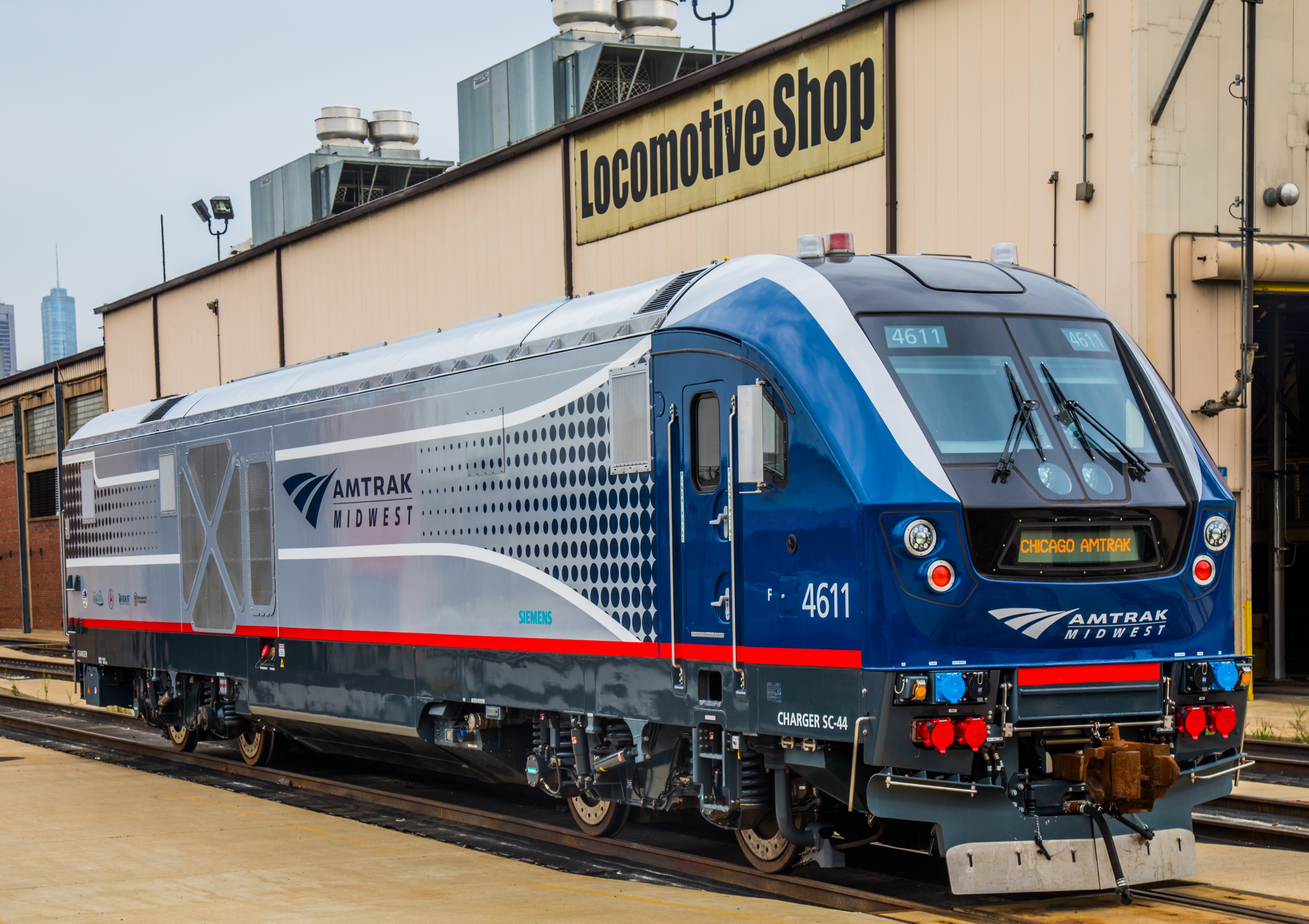
New Amtrak Charger Livery released. And according to the article there is more to come next year.
Replies sorted oldest to newest
Hmmm...
Shades of AM Road???

![]()
Rusty
Attachments
Bring the silver in past the grill, and replace the current Amtrak logo with the 1970's arrow.
Cool, but I think that all that blue may fade rather quickly.
I think it is ugly. Bring back the F40PH livery.
sharpe,thanks
Now to obtain Tier 4 rating, do these locomotives require DEF?
I find the new livery to be very appealing and curious what the one slated to be painted for the 50th anniversary will be. Personally I like the Charger look over the Genesis series.
The question is with the latest slew of Amtrak Directors, will there be any trains for it to pull?
Not a huge fan of this paint scheme. In my opinion, there is waaayyyyy too much blue.
Personally, I think the Chargers would look very slick in either Phase III (especially the Dash-8-32BWH scheme) or a Phase I/Phase II combo (Phase II stripes with a Phase I arrow).
Bryce
@jay jay posted:Cool, but I think that all that blue may fade rather quickly.
I dunno. Blue seems to hold up rather well on Metra units.
Rusty
The livery is fine, but one thing about this locomotive design that I've wondered about is the lack of any front quarter vision. It's completely blocked.
Attachments
Not loving that much blue.
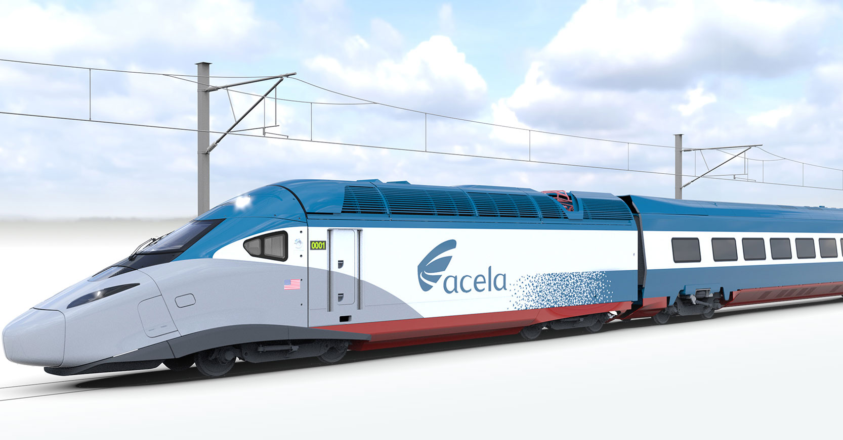
The new Acela paint would be better, or a variation on the theme.

@breezinup posted:The livery is fine, but one thing about this locomotive design that I've wondered about is the lack of any front quarter vision. It's completely blocked.
I had the exact same thought.
TRRR
@breezinup posted:The livery is fine, but one thing about this locomotive design that I've wondered about is the lack of any front quarter vision. It's completely blocked.
Don't the P40's have the same issue???

Or the new Acela's...
Rusty
Attachments
@breezinup posted:The livery is fine, but one thing about this locomotive design that I've wondered about is the lack of any front quarter vision. It's completely blocked.
I looked on various Siemens info pages about this. I found on reference to cameras for station entry/support or something like that, but nothing else.
Man the Charger is a ugly locomotive. Too much box shape maybe? EMD and GE hood freight locomotives look better to my eyes.
I love it! It looks modern but with a touch of history. Passenger cars should get a blue window stripe with the red arrows at the car ends. Amtrak needs a paint scheme that is eye catching like this. The bland current scheme is not eye catching.
Well seeing that neither Siemens or Amtrak are going to listen to opinions from the OGR Forum, we'll just have to deal with it.
Rusty
PErsonally, the Demo Scheme was better.

Agreed, Way too much blue!


