Well, a few thoughts:
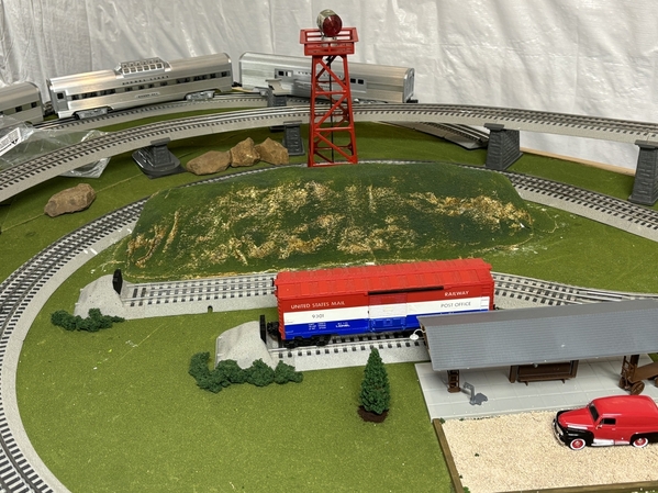
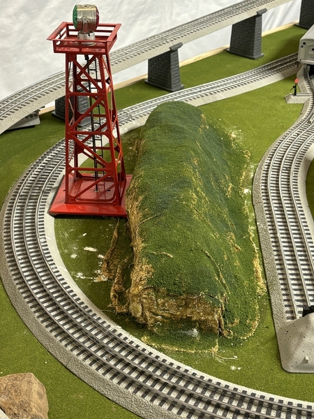
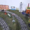
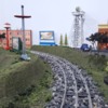
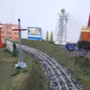
- First, not a bad first effort at all IMHO -- good texture and coloring on the rock, forming a decent basis for the "cake decorating" you can do over the top and down the sides.
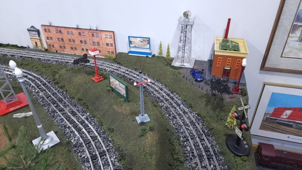
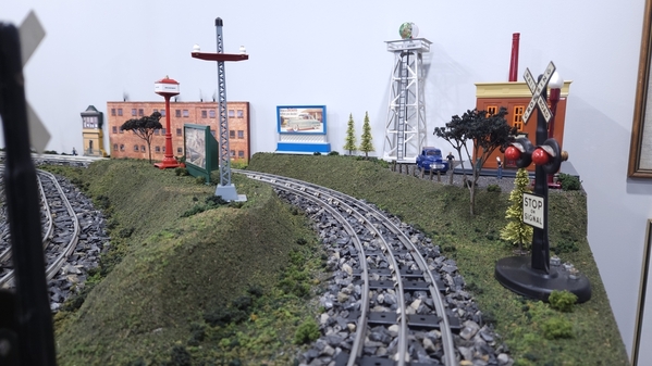
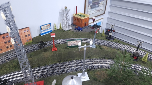
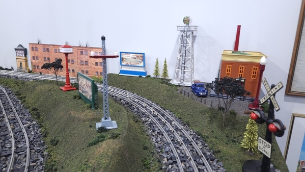
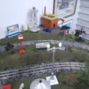
- OTOH, the shape seems to my eye somewhat arbitrary and loaf-like, an abrupt and somewhat inexplicable intrusion into an otherwise board-flat and rather uniform layout platform. Believe me, I understand the dilemma (and have been there myself more than once!): it's a lot easier to just unroll the grass mat over the plywood and/or foam so you can lay the tracks and start operating (and FWIW many operators choose to just leave it like that), but that does leave a very obvious blank slate on which you must 'write' your landscaping 'story' (if you choose to tell one). The shape does not seem to follow the adjacent tracks, which if it did could support the potential viewer's impression that this was, as you say, a man-made cut through a natural outcropping. Instead, the shape is more reminiscent of an old-fashioned paper mache tunnel, forming an obvious add-on.
- The grass seems a bit too heavy on the vertical faces, and in any case a bit too uniform in color and texture. If the underlying structure is intended to represent a rock cliff (as it seems to be), any grass and other vegetation will grow poorly (if at all) on any vertical surface, and be lush (if at all) only on flat surfaces that have accumulated some soil. OTOH, if you are instead depicting an accumulation of soil and aggregate rather than solid rock, whether flat or sloped, you can be more liberal with the grass shaker. Otherwise, a few lines of white glue on the flat cracks and crevices, followed by sprinkles of grass, and removal of the excess when dry, is likely to be more realistic.
- Even with sparse vegetation, there's typically a lot of variety IRL. Bushes (ground foam) and small trees are wont to take root in available crevices, and even some flowering bushes or wildflowers can be scattered where appropriate, something to catch the eye and help sell your 'story' of encroaching nature.
- Finally, some further effort needs to be made to transition such an outcropping into the rest of the landscape. Here, there's a clear margin of base color visible, with little apparent effort to blend it into the surrounding scenery. Believe me, I still have plenty of such abrupt transitions on my layouts, but anything that you can do to make the piece seem a more organic part of the larger layout will help sell the illusion of the model.
I hope my comments haven't been too abrupt or demeaning -- certainly neither was intended, and are instead offered in the spirit of a constructive critique as you have requested. Besides, I'm getting too old to beat around the bush, even one on a rock face on the layout! 
